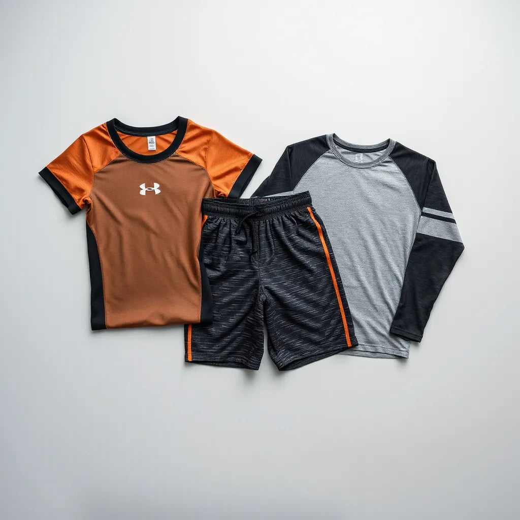
Custom Printed Athletic Wear: Design Tips That Win
Custom printed athletic wear is the quiet MVP of every team closet. It turns “we showed up” into “we belong here,” without forcing everyone to wear the same personality. Whether you’re making matching warm-ups for a league night, sprucing up a club fundraiser, or finally giving your gym bag a history lesson, custom prints let you look intentional. And yes, the artwork can be subtle or loud—your call. Either way, you get durable designs, fast personalization, and a fit that feels like it belongs to your group, not the supply chain.
Updated on: 2026-07-08
Custom printed athletic wear helps teams and clubs look cohesive without turning every outfit into a billboard. You can choose artwork placement, colors, and styles that match your vibe, from classic to playful. With the right fabric and print method, your designs hold up through practice, travel, and repeat wear. This guide breaks down myths, planning steps, and practical tips so your order lands like a perfect back-check.
- 1. What Custom Printed Athletic Wear Actually Means
- 2. Myths vs. Facts
- 3. Step-by-Step Guide
- 4. Design That Lives On (Without Looking Like a Sticker Panic)
- 5. Fabric and Fit: The Match That Makes the Team
- 6. Common Print Issues and How to Avoid Them
- 7. Frequently Asked Questions
- 8. Summary & Key Takeaways
- 9. Q&A Section
What Custom Printed Athletic Wear Actually Means
Custom printed athletic wear is exactly what it sounds like: performance-minded apparel with designs printed on purpose. Think tees and hoodies with a small logo at the chest and a bigger illustrated graphic on the back. It’s not just “put a picture on a shirt,” though some people treat it like they’re feeding a printer a selfie and hoping for the best.
In practice, it’s about consistency and intention. Your group gets recognizable style across outfits, practices, and events. You also get the joy of seeing the same artwork on different people—like your club has its own crest, minus the complicated heraldry lessons.

Illustrated badge concept: crest, stripes, and centered emblem
Myths vs. Facts
Let’s clear the fog. Because every “I heard that…” story deserves a small fact check and a slightly embarrassed nod.
-
Myth: Custom printed athletic wear is only for big teams.
Fact: Small groups can look just as polished. You’re not building a stadium brand—you’re building identity. -
Myth: Prints always crack or peel after a few washes.
Fact: Print quality and proper care matter. When the process and materials are right, the design stays crisp longer. -
Myth: You need complicated artwork to get a good result.
Fact: Clean logos and strong illustration work great. Good design beats busy design every time. -
Myth: Ordering takes forever.
Fact: Planning helps. If you set your specs early—colors, placement, and quantities—you prevent the “mystery delay” feeling.
Step-by-Step Guide
Here’s the practical route, minus the dramatic “choose chaos” energy. Follow these steps and your order will feel less like guesswork and more like a well-run bench warm-up.
-
Pick your apparel base. Choose tees and hoodies that fit how your group actually lives—practice days, travel weekends, casual meetups.
-
Decide placement. Common patterns are a small chest logo and a larger illustrated back graphic. Placement keeps the look clean from every angle.
-
Select colors intentionally. Match your palette to your organization. If you already have team colors, start there. If you don’t, pick two main tones and one accent.
-
Choose your artwork style. Vintage-inspired illustration, simple monograms, or line-art crests—pick a look that won’t feel dated in a year.
-
Confirm sizing and quantities. Plan for the real world: a few extra for friends who “definitely want one later.”
-
Review mockups. Check scale and spacing. If the artwork is too small, it disappears. If it’s too large, it shouts. Balance is the goal.
-
Plan care instructions. Washing and drying habits make a difference. Read the care guidance that comes with your order and follow it like you mean it.
Design That Lives On (Without Looking Like a Sticker Panic)
Think of your design like a good sweater: it should fit the occasion without trying too hard. Here are the choices that tend to look best on custom printed athletic wear.
Keep the front calm
A small chest logo is the classic move. It reads clearly even in motion and it looks sharp under light jackets. Plus, it’s the kind of detail you notice every time you wear it, not just on day one.
Make the back the story
A larger illustrated back graphic gives personality and turns the hoodie into a wearable poster—without needing neon or a megaphone. Aim for strong contrast and enough negative space so the illustration doesn’t turn into a gray blur.
Use a limited color palette
More colors can be fun, but too many tones can reduce clarity. A tight palette improves readability and keeps production consistent across shirts.
Audit for readability at distance
If you’ve ever tried to read a sign from a parking lot, you already know the problem. Your back graphic should be readable from a few steps away, not just when someone is standing a millimeter from your shoulder.

Back-graphic layout: bold illustration frame and clean spacing
Fabric and Fit: The Match That Makes the Team
Even the best artwork can look off if the fabric and fit don’t cooperate. You want material that feels comfortable, moves well, and survives the routine of wearing and washing.
Choose a weight that fits the schedule
Tees for breathability and hoodies for that steady “I’ve got plans” look. If your crew wears them year-round, choose fabrics that don’t feel clingy or stiff after a few seasons.
Prioritize comfort over costume
Teams tend to think, “We just need it to match.” True, but match with comfort. If the shirt is scratchy or the hoodie rides up constantly, people won’t wear it. And what’s the point of custom printed athletic wear if it becomes a closet museum piece?
Think about layering
Hoodies should work under a coat. Tees should fit under a jacket without bunching. Planning for layering makes your uniform feel natural instead of forced.
If you’re curious about brand-style options and the vintage-inspired vibe that suits crossover athletes, you can browse the shop here: Crossbar Athletic.
Common Print Issues and How to Avoid Them
Let’s tackle the usual suspects. These aren’t horror stories—just the typical “how did this happen?” moments.
-
Fading after repeated washes: Wash in cold when possible, and avoid aggressive drying heat. Treat your prints like you treat a good watch: give them less drama.
-
Cracking or peeling: Incorrect care, harsh detergents, or rough drying can contribute. Follow the care guidance and avoid washing with items that have sharp edges.
-
Artwork looking blurry: Low-resolution files or tiny text can cause softness. Use high-quality artwork or clear logo files.
-
Misaligned or uneven placement: Mockups help. Confirm placement early, and double-check the scale of your chest and back graphics.
-
Color mismatch: Compare your color expectations with actual printed output in mockups. Lighting and screen settings can be sneaky.
For teams that prefer a more uniform, heritage look, it can help to review organization details and keep design decisions consistent from batch to batch. (Your future self will thank you when you’re not squinting at a spreadsheet like it’s a mystery novel.)
Frequently Asked Questions
How do I choose between a small chest logo and a big back graphic?
Use the chest logo for easy, everyday identity and the back graphic for the main story. Most groups like the front being subtle and the back being memorable, especially for hoodies and tees worn at events.
Can custom printed athletic wear work for casual clubs, not just competitive teams?
Absolutely. Clubs, leagues, alumni groups, and even hobby squads use custom designs to look unified. A vintage-inspired style with a clean logo layout tends to work well for casual settings.
What should I prepare before ordering?
Have your quantities, preferred placement, and a simple description of your artwork style ready. If you have existing logos, use them. If you don’t, choose reference images that match your desired look so the final result stays on brand.
Summary & Key Takeaways
Custom printed athletic wear is a reliable way to build identity without turning your closet into a costume shop. Plan your apparel base, decide placement early, keep the palette clean, and review mockups for scale and spacing. With simple care and good design choices, your team’s look stays sharp through practices and events. Ready to outfit your crew with a heritage, crossover-ready style? Contact us and tell us what your group wants to wear on game day—or at least game-adjacent days.
Q&A Section
Is it worth ordering custom printed athletic wear for a small group?
Yes. Small groups benefit most from the “quiet consistency” effect. Even a handful of tees or hoodies can create a shared look that feels official without feeling over-produced. Plus, it’s a great way to unite new members without forcing anyone into a complicated uniform plan.
How can we keep the design from looking messy or overly busy?
Start with two jobs for each area: front equals simple branding, back equals the main illustration. Limit colors, keep text readable, and avoid squeezing everything into one corner. If your design has multiple elements, give them space so they can breathe—like athletes on a well-earned break.
What care routine helps prints last longer?
Follow the care guidance included with your order. In general, wash gently, use cooler settings when available, and avoid high heat drying. If you want to be extra thoughtful, turn garments inside out before washing to reduce wear on the artwork.
Where do I find team-inspired apparel options?
You can explore the Crossbar Athletic lineup and style cues directly on the site. If you’re building a uniform look with vintage charm, start with Crossbar Athletic and then tailor your custom ideas from there.
About the Author
Jordan Rivera is a brand storyteller and apparel production enthusiast at Crossbar Athletic , with a focus on vintage-inspired design systems and practical print planning. They’ve spent more time than they’d like to admit comparing artwork placement and fabric behavior, so your hoodie doesn’t end up looking like it lost a tug-of-war. When not obsessing over details, Jordan enjoys game-day style notes and coaching teams on keeping their look cohesive. Thanks for reading—may your graphics be crisp and your team look iconic.
Disclaimer: This article provides general guidance on planning and maintaining printed apparel. Results can vary based on garment materials, artwork details, and customer care routines. Always follow the care instructions provided with your order.